

A website is particularly useful as it is arguably a very
effective means of marketing seeing as all the artists work is on place like a
kind of "hub" allowing for all kinds of synergy with different music
platforms such as iTunes and Spotify as well as social media platforms such as
Twitter and Facebook. This cross media convergence is useful for the audience
as they can easily navigate from platform to platform but it is also useful for
the recording company and artist as not only is it consolidating their brand
but they will be making money off it.
We asked our target audience what they would expect/want to see when they go onto an artists website and the main features which came up were. We made sure to have this as our essentials and to therefore incorporate it into the website.
- merchandise store
- information about the artist
- tour dates
The example that we were really following in terms of aesthetic was Selena Gomez's website


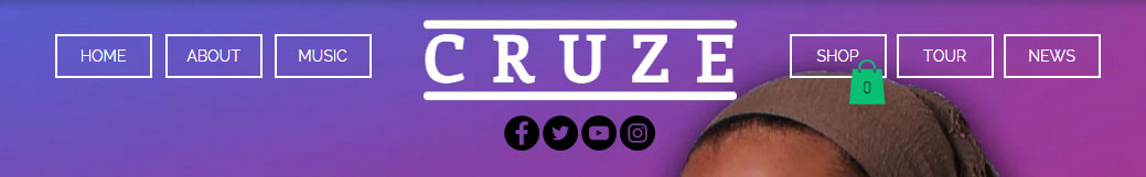
We first designed the menu bar for our website, which includes the artists band logo clearly in the middle. The menu bar is an absolute essential as it is the key way people will be able to navigate across the website.

· About - the gives personal information about the artists adding
more depth to them
· Music - the consumer will be able to purchase the album and
individual songs as well as be able to have some insight into song writing and
the inspiration behind the album - the music video will be embedded here
· Tour - location and dates for live performances
· Shop - consumer will be able to buy merchandise such as T-Shirts,
jumpers, posters and mugs
Our group conducted website research and afterwards we had a meeting where we discussed our findings, the conventions of a website and our own personal visions for the website. Soon after we all found common ground. Below are rough drawings of our first website draft
This showcases the homepage of our artists. The main parts to take away from this is the large focal images which move on rotation horizontally, revealing images focused on advertisement of the album, the tour as well as promotional shots and behind the scenes footage.

The audience will be able to scroll down the website to reveal even more engaging content including snippets of different sections such as the "About" section (which allows the audience to learn much more about the artists and what they believe in) and a live twitter feed (which allows the audience to see updates on the artists life and events to look forward to).

Soon after audience feedback and sharing ideas between each other (group members) we decided that there were some more features that we wanted to incorporate.
Such as...
- A greetings page that will have our artist logo, this will appear before the user will access the website.
- An interactive slide show of our best promo shots that will be from the Instagram account.
- Available links to social media and the music video
No comments:
Post a Comment